
Case Study: Web Responsive Design
Role
UX/UI Designer
UX Researcher
Tools
Figma
FigJam
Timeline
Oct 2023 - Nov 2023
Background
In today's fast-paced world, the airline industry plays a crucial role in global connectivity, offering passengers the ability to travel quickly and conveniently. Travelers are increasingly relying on digital platforms to plan, book, and manage their journeys. I’ve noticed that some airline sites can be very cluttered making essential information difficult to find. Furthermore, there were also optimization issues with mobile and web. With this project, I wanted to take the opportunity to address these issues and create a responsive web design with the focus of simplifying the booking process for users.
Challenge
TakeOff is a fictional airline company that aims to establish themselves in the airline industry. My challenge was to create a responsive website to help users book flights on both desktop and mobile devices.
Research and Analysis
In order for me to understand the competitors in the airline industry, I conducted a competitive analysis on four airlines operating within the U.S. This analysis enabled me to gather insights to their strength and weaknesses which helps me identify any gaps in their features that TakeOff might be able to address.
User Interviews
After gathering a general understanding of the market, I wanted to gain the perspective of airline travelers to collect user insight in their booking experience. I conducted 5 interviews with those who frequently use airlines to plan their trips. These users were between the ages of 19 - 28.
Sample Research questions:
What are the key criteria you consider when searching for flights? (budget, travel dates, non-stop options, travel time, layovers) Can you explain why you take these into consideration?
How important are filters, such as price range, departure time, and layover duration, in helping you refine your flight search results?
What factors influence your decision to choose a specific airline for your travels?
Have you ever encountered any difficulties or confusion while checking in for your flight? Can you share an example?
Do you use airline mobile apps to book and manage your flights? Why or why not?
Key Insights
User Persona
After I conducted user interviews and understood their goals and needs, I was able to create a persona that reflects one of many types of airline travelers. Meet Mia, a social media influencer who travels to create content. She often finds herself struggling with complex booking process for her travels. She needs a platform that simplifies the booking process and saves her time.

POV Statement and HMW Question
I took the user needs of the Mia persona to draw in key insights and define the problem I’m going to solve. I created a POV statement that helped me focus on the specific problem faced by users when they book their flight. I then created the HMW question to ideate possible solutions that address users needs identified in the POV statement.
POV - I’m a passenger trying to book flights in the busy holiday season, but I face trouble completing the booking process because the airline’s website is not responsive, making it difficult to complete my reservation on my phone.
HMW - How might we ensure that passengers can seamlessly book flights on various devices and improve the responsiveness and usability of the airline's website?
Project goals
I utilized the insights from the user interviews and the goals of the MVP to create the project goals. This gives me a better sense of how to prioritize the needs of both perspectives and target specific problems. Listing the goals allows me to have an overview of the product to start determining features in the roadmap.
Feature Roadmap
Using the project goals I created a roadmap for features to implement based on priority. For this project, the stakeholder requested to include the P1 features as part of the MVP. I based P2 and P3 of the feature set on competitive analysis and secondary research of other airline offerings that also meet user needs.
User Flows
With the feature roadmap in mind, I created two task flows that Mia would conduct while using TakeOff to book her flights:
1. Search for flights and complete booking process for a trip
2. Complete the online check-in process for a upcoming flight
By creating these task flows that center around the key features of TakeOff, I was able to visualize and examine the user experience in detail. Through this process I was able to map out the pages I needed to design for the users to successfully complete their tasks.
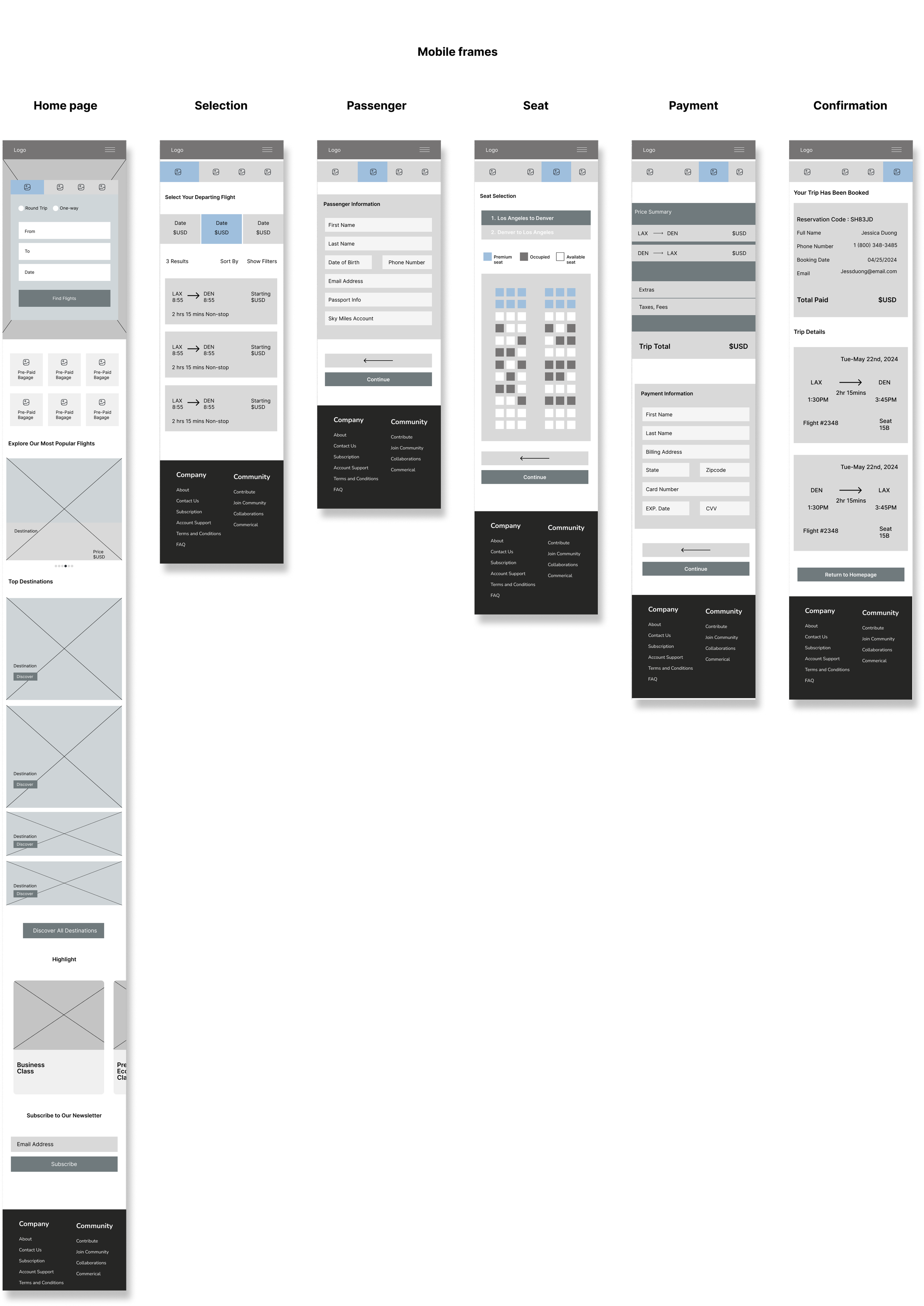
Low-fidelity wireframing
Once I had the user flow mapped out, I produced digital low-fidelity wireframes to create the visual layout of how the site would come together for both desktop and mobile version. This helped me apply simple UI elements and establish hierarchy without having to spend too much time on the details. Through this I was also able to ensure that the desktop/mobile wireframes were properly responsive so that users have a consistent experience across various devices.

UI Kit
Before moving from the low-fidelity wireframes, I developed a UI kit that would bring the visual elements together for the high-fidelity wireframes. This kit serves as a reference for future designs and ensures that the user interface remains cohesive throughout.
High-Fidelity Wireframes
I applied the style tile and UI kit with the low-fidelity wireframes to create a high-fidelity mockup. This process allows me to examine the visual elements to ensure they maintain cohesion with the branding.
Usability Testing
Goal: Identify any pain points with usability, evaluate the task flows and ease of navigation, and gather feedback to improve on the overall product.
Participants: 5 participants that were previously recruited for user interviews
Success Metrics
User satisfaction: How the user feels about the overall tasks (80% - 100%)
Average time to complete task: Measuring average session duration on each task (1 - 2mins)
Success rate: Percentage of users successfully accomplishing tasks (80% - 100%)
Task Flows:
1. Search for flights and complete booking process for a trip
2. Complete the online check-in process for a upcoming flight
Insights
Pain Points
Users felt a bit unsure of what step they were in during booking process
The mobile version did not have a clear back button to go back a step during the booking
Results
100% of participants were able to complete both tasks
Satisfaction rate was above 90% for both tasks
Average completion time was under 1 minute
Iterations
Using what I gathered from the usability testing, I iterated the design based on priority revisions due to the time constraint of the project.
Revisions to the Home page
Applied visual consistency to button styles
Added a active tab indicator to the flight booking section
Added page breaks by adding color to the different sections
Updated button and text color to ensure better contrast
Revisions to Flight selection page
I added a progress indicator based on feedback from participants to better indicate which step they were on while booking
Revisions to Passenger details page
Reorganized the information hierarchy of the passenger’s middle name and last name
Made the back button more clear by redesigning the Total cost section so users are able to go to previous steps if needed before proceeding
Final Product

Reflection
This was the first project where I learned how to prioritize the user journey in the design process. I had to make sure that the user’s journey in their flight search/booking had clear and efficient navigation pathways so that users were able to complete tasks with minimal frustrations. Ensuring a responsive interface was also crucial in meeting user’s expectations of being able to search/book flights on various devices. Overall, I gained a stronger understanding of ensuring a consistent experience for the users across devices.
Future opportunities
I’d like to be able to include more features such as low fare calendars and travel extras (checked baggage and priority boarding) during the booking process.
I feel like there’s always room for further improvements on the overall design. Updates and revisions will continue in the future based on priority.
Other Projects:

Palate
End-to-end mobile application for ranking and reviewing restaurants.

Spotify
Introducing a music identification tool to Spotify, helping users discover new music on the go.