Case Study: Mobile end-to-end app
Role
Product Designer
Tools
Figma
FigJam
Timeline
Dec 2023 - Jan 2024
Background
The restaurant industry is known for its constant evolution, with individuals continuously seeking fresh dining experiences.
Traditional restaurant review platforms extensively provide information but often fail to deliver the personalized insights that modern diners crave. I’m an avid Yelp user when it comes to discovering inspiring places to eat, however, I find myself scrolling through countless results just to find one restaurant I might be interested in trying. Often times, the first results consist of options that Yelp constantly promotes. Without personalized recommendations, I wanted to explore designing an end-to-end app that addresses the gap by introducing a social-driven food ranking/review app.
Problem
Individuals seeking to explore new restaurants in their area struggle to find curated lists of restaurants that cater to their specific interests.
Research and Analysis
Competitors had NO SOCIAL RECOMMENDATION aspect.
I wanted to understand the strengths and weaknesses of the current market, so I conducted a competitive analysis on four popular food review platforms. My goal was to gain insights into the user experience design and features that resonate well with their users. These insights would also provide me with the opportunity to differentiate this app with innovative solutions that these platforms lack.
I found that they all provided an extensive amount of reviews from a variety of users, which can lead to a broad range of opinions. With the vast amount of reviews and varying opinions, finding trustworthy recommendations can be difficult. Additionally, users cannot see if their friends have been to that restaurant and recommend it.
User Interviews
To understand and gather insights into user habits, preferences, and experiences with seeking recommendations from their social circle, I conducted 5 interviews with those who have a passion for food and enjoy exploring new dining experiences between the ages 21 - 35.
Sample Research questions:
What is your current process from discovering new restaurants?
What challenges have you faced with finding restaurant recommendations?
Do you usually rely on recommendations when choosing a restaurant? Why or why not?
What makes a friend’s recommendation more valuable to you than an online review from a stranger?
How frequently do you check online reviews before choosing a restaurant? Can you elaborate on your frequency to check reviews?
To help break down insights from the interviews, I created an Affinity Map to identify themes and patterns.
User Persona
Based on the insights I gathered from the user interviews, I created Dennis, a millennial food influencer.

POV Statement and HMW Question
I used the understanding of the user needs from the persona to pull key insights and formulate the POV, framing the problem for the HMW.
POV - I’m a food enthusiast trying to discover new restaurants in my area, but I’m unable to find lists of restaurants that excite me, because there is an overwhelming number of choices with generic recommendations.
HMW - How might we help food enthusiasts discover exciting local restaurants amidst an overwhelming number of choices and generic recommendations?
Ideating a solution
After defining the problem, I used the HMW question to launch my ideation process.
During my feature exploration, I used competitive analysis and user research to formulate the key features needed for this initial iteration. I identified features that focused on the objective of providing users with social capabilities similar to a social media platform enabling them to share and connect with others. After gathering key features, I prioritized them to identify the core functionalities required for the MVP. This would allow for a timely release of the app with essential features and ability to gather user feedback.

Sitemap
With the features prioritized, I started to work on the information architecture for Palate.
To provide a visual representation of the app’s structure and organization, I created a sitemap. Since this is a social-driven restaurant review/ranking app, I modeled the structure to be similar to known social media platforms like Instagram. The main navigations include a Feed/Homepage where users are able to explore top restaurants and recent rankings posted by their friends, a lists page for easy restaurant tracking of where they’ve been to and where they saved for their want to try, a search to find restaurants and other members on the platform, and a profile page for users to manage their following and lists.
User Flows
Once I established the structural organization with the site map, simplifying the process of mapping out the user interactions through user flows.
I created two main user flows that focused on the app’s key features to provide a visual of how Dennis would interact with the app:
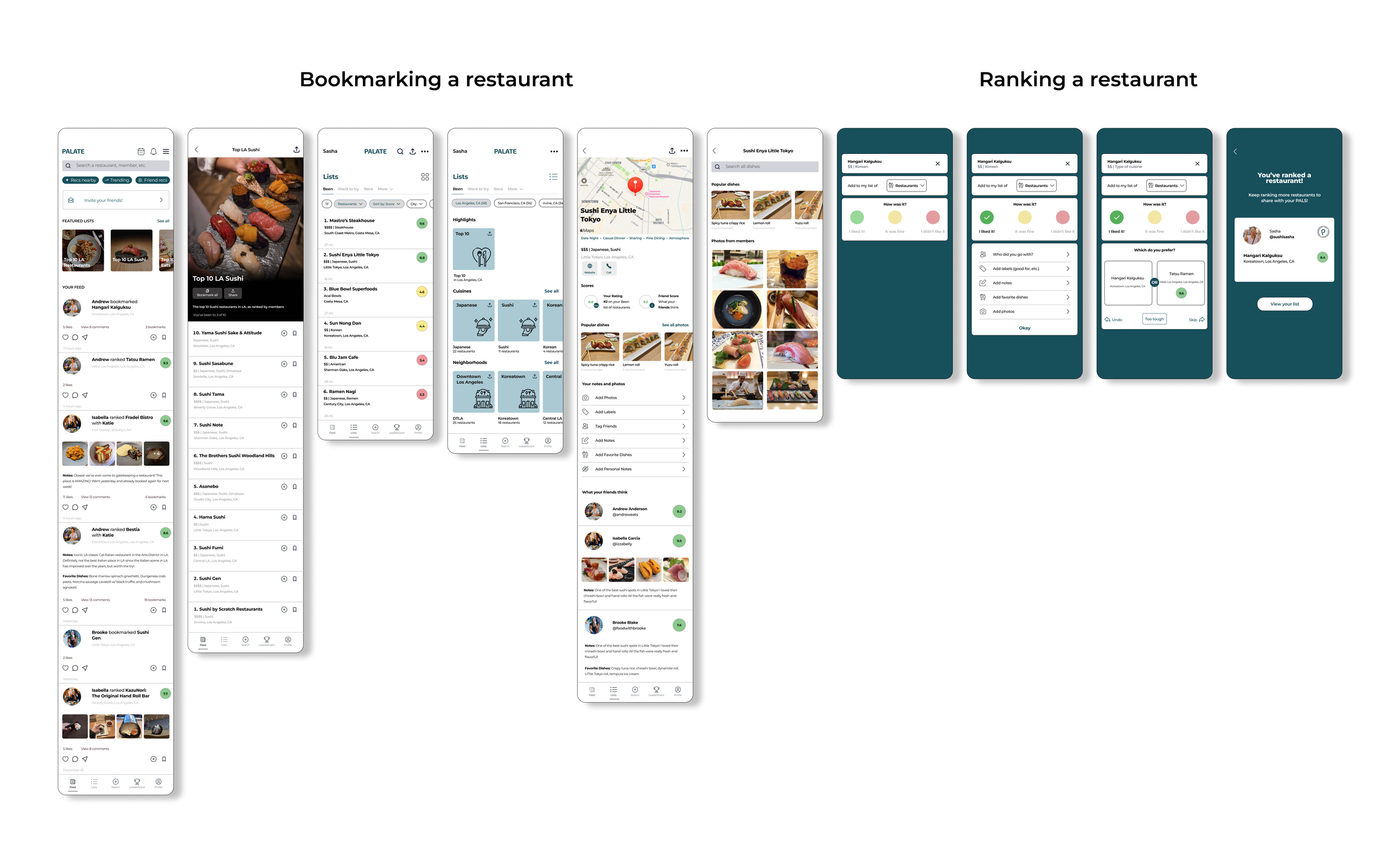
1. Bookmarking a restaurant to your Want to Try list
2. Provide a restaurant ranking
These flows help ensure that the essential functionality of the app is efficiently organized, guiding users through logical pathways that enhance usability and overall satisfaction.
Design process
Low-fidelity wireframing
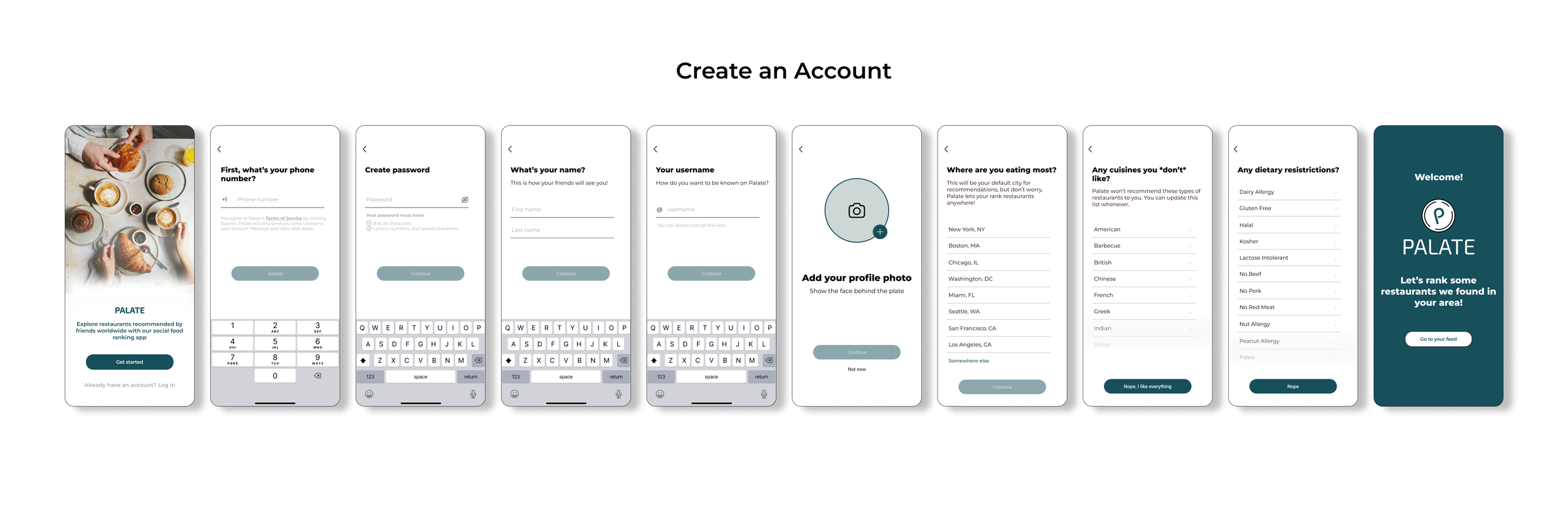
Utilizing the sitemap and user flows, I was able to create structured low-fidelity wireframes. These wireframes served as the initial representation of the app’s layout and functionality, incorporating key elements such as account creation, feed exploration, bookmarking a restaurant, and ranking a restaurant.
Early Testing
User testing on Low-Fidelity Wireframes
In order to gather feedback on the initial design concept, I conducted early usability testing on the low-fidelity wireframes. The goal of the usability testing was to identify any pain points with usability, evaluate the ease of navigation with task flows, and collect feedback on user satisfaction of the low-fidelity layout.
User tasks:
1. Complete Creating Account/On boarding process
2. Bookmark a restaurant to lists
3. Complete a restaurant ranking
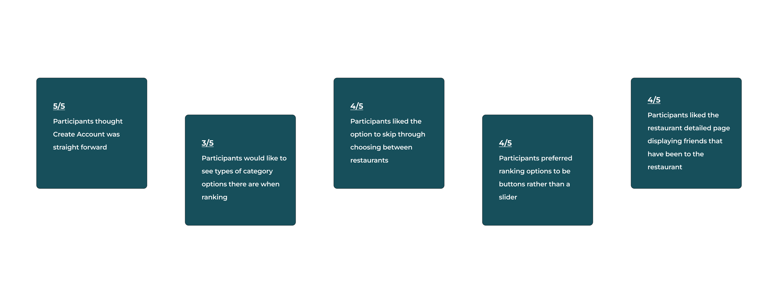
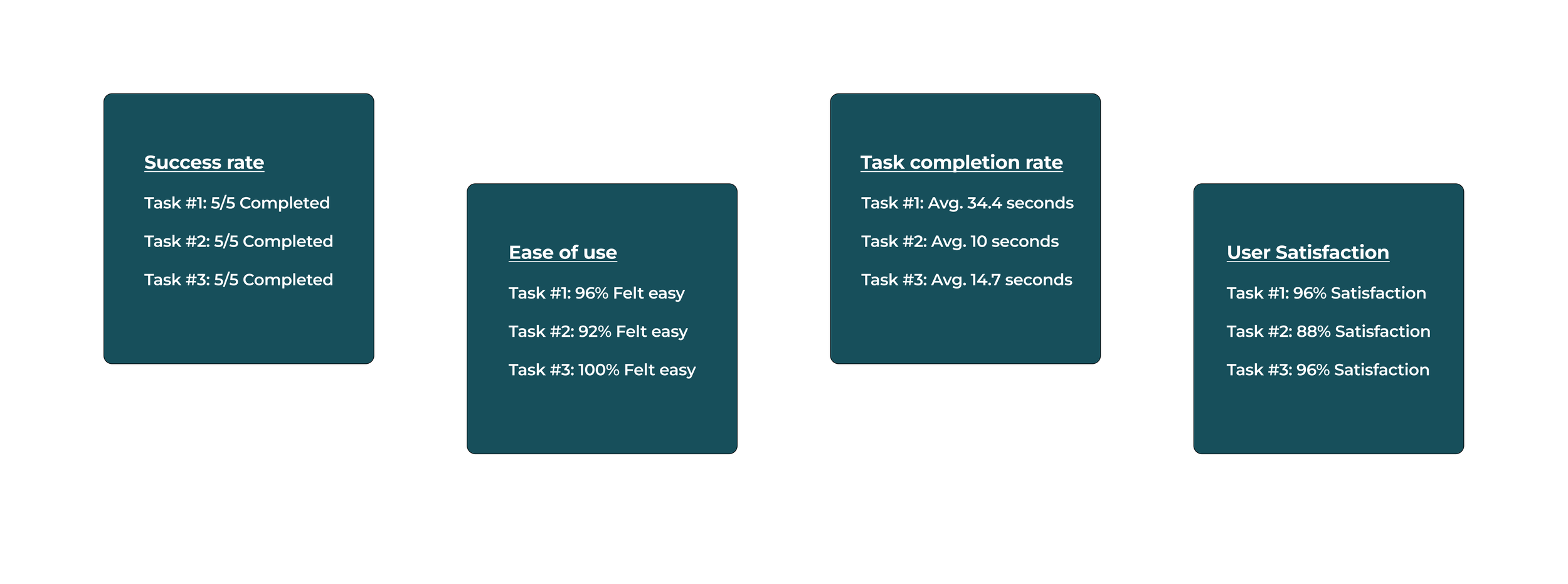
Findings from user testing
Design identity
I was able to use the user feedback to craft visual elements that aligned with user expectations.
To ensure a cohesive brand identity, I created a UI kit comprising various elements to be used throughout the design process. I chose to have a simple and clean UI so that the spotlight is placed on the app’s content, which is food ratings and reviews. A minimalistic design ensures that users can focus on the essence of the app — discovering and evaluating food experiences — without being overwhelmed by excessive design elements.
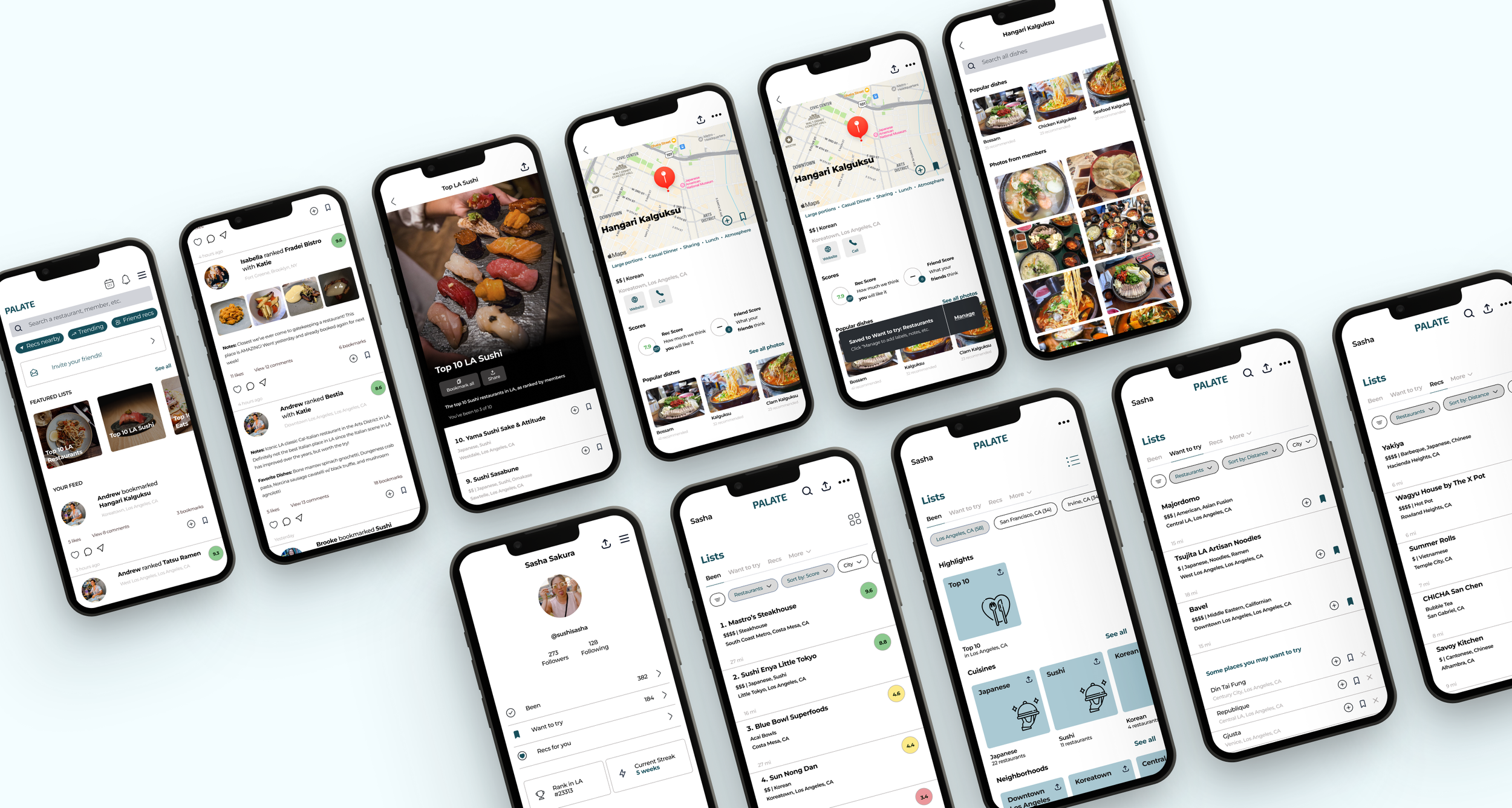
High-Fidelity Wireframes
I applied visual elements and UI components to create high-fidelity wireframes.
I incorporated elements of typography, illustrations, icons, color, and images that align with the brand identity of Palate to produce a high-fidelity version of the app. With a more realistic preview of the product, I could observe how users interact with this mockup and gain valuable insights to make iterative improvements based on test findings.
More usability testing
User Testing on High-fidelity
Once I produced the high-fidelity version, I conducted another usability test to identify any pain points with the functionality of the design. The main goal was to evaluate the user’s efficiency with tasks, access ease of use, identify pain points related to flow, and the overall user experience.
User tasks:
1. Complete Creating Account/On boarding process
2. Bookmark a restaurant to lists
3. Complete a restaurant ranking
Findings from user testing
Iterations
3 major improvements for my design
Based on various feedback from peers and users, I iterated my design over a span of 2 weeks with 3 major improvements:
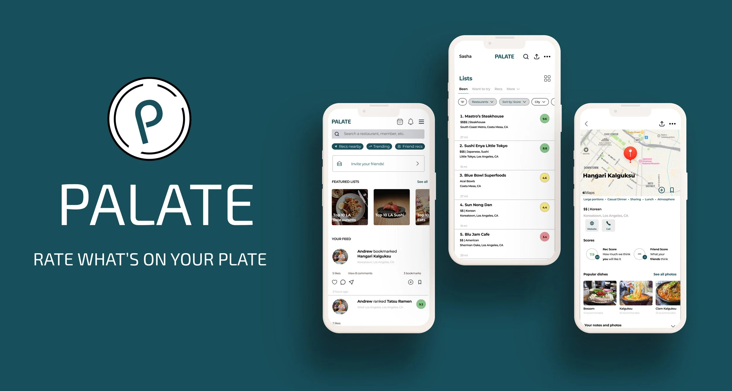
final Product
Palate, a social driven food ranking/review app.
Reflection + Key learnings
What I’d do differently next time.
Working on this project gave me a lot of insight into creating a MVP for an end-to-end app while having time constraints. With the time constraint, I prioritized the essential tasks that a social-driven restaurant ranking/review app such as Palate required, but I had to set aside some features that would have made Palate stand out. Here’s a few things I identified for future opportunities to improve upon:
1. Implement a better strategic time management plan. With a better plan in place, I could explore some gamification features like reward badges to increase user participation and long-term retention.
2. Showcase social interactions. Despite having the key functionality of seeing your friends' ranking of a restaurant, I feel that I fell short in showcasing how users would be able to share and recommend lists to one another. Highlighting these social interactions within the app would help foster a collaborative community experience.
3. Include more key screens in ranking flow. Including more key screens in the ranking flow highlights how users can add their own details and notes when ranking a restaurant. Although I have the add notes, tags, favorite dishes, and photos feature shown during the ranking process, it would have been nice to provide a visual of how users are personalizing their ranking through each category.
There’s certainly a lot that can be improved. I'm going to be able to apply these learnings to future projects, but overall, I'm quite happy with how this project came together.
Other Projects:

Spotify
Introducing a music identification tool to Spotify, helping users discover new music on the go.
TakeOff
A responsive web design for a fictional airline company.